Sunny Daycare
As families grow, many parents find themselves balancing work, home, and the endless tasks of daily life. Sunny Daycare was created to be the warmth they can count on — like the sun breaking through on a snowy day. Its mission is to offer parents a space that feels like a welcoming hug, where children are cared for with joy and creativity. At Sunny Daycare, every smile is a ray of sunshine, lighting up faces and filling the community with warmth.

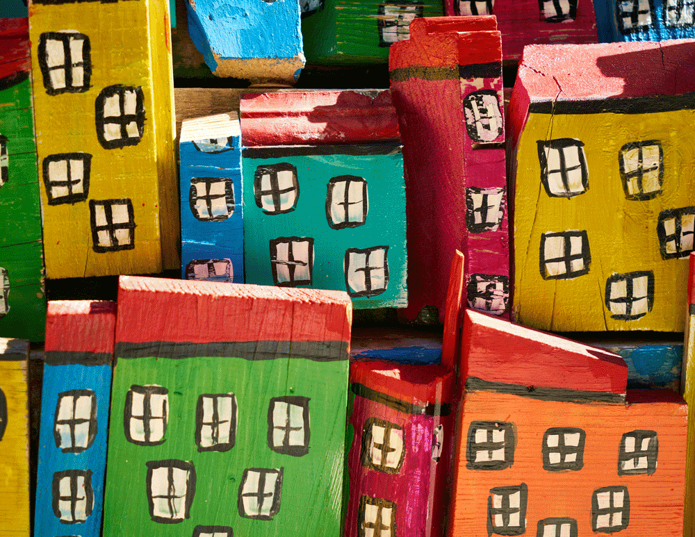
In developing the brand identity, Saba drew inspiration from the simple joy of childhood — building blocks, playful shapes, and the bright energy of the sun. The strategy was to design a visual language that feels approachable, warm, and full of light, reflecting the daycare’s promise of care and positivity. The result is a brand that radiates both playfulness and trust, putting smiles on faces and creating a space where families feel supported.


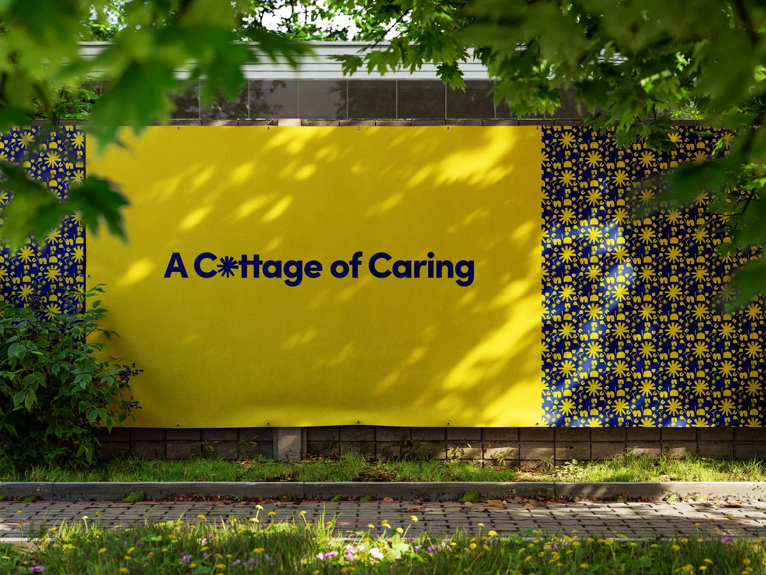
There is the place everybody was looking for, somewhere that reminds you of a cottage of caring!


The Outcome
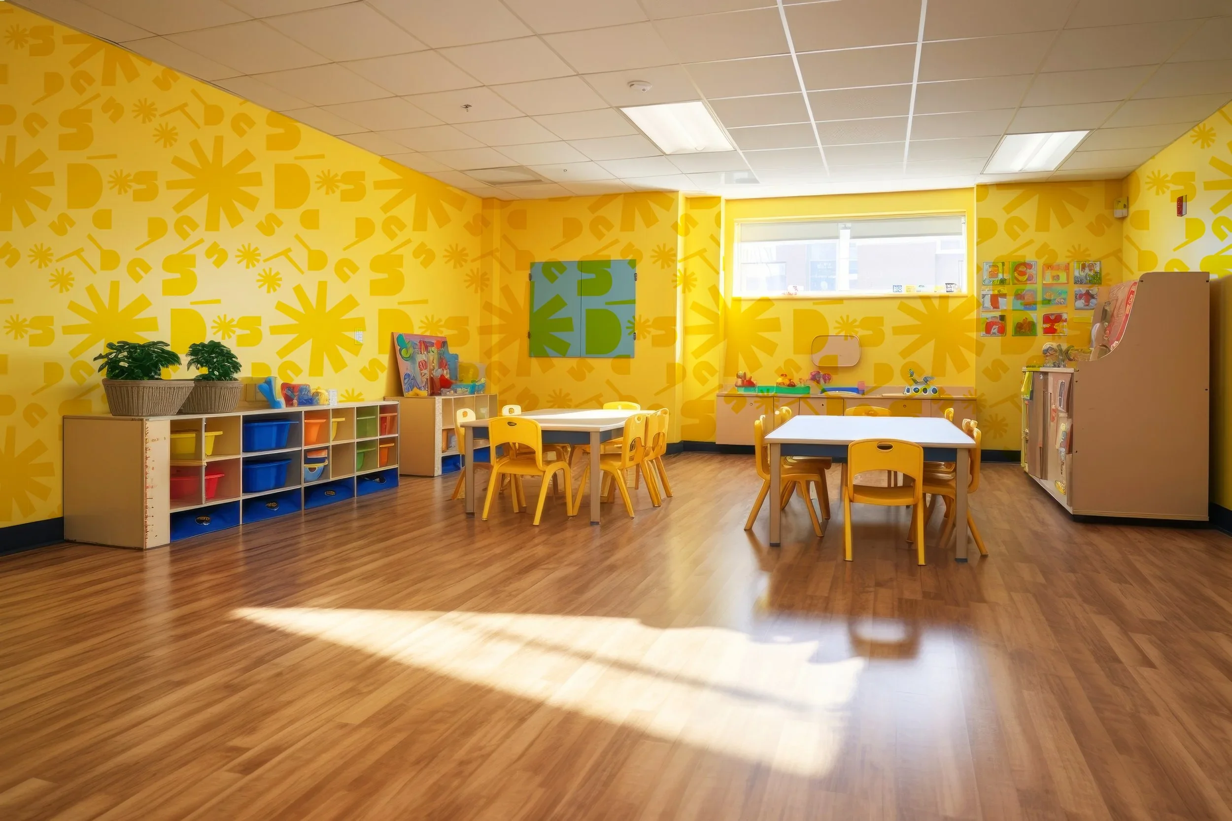
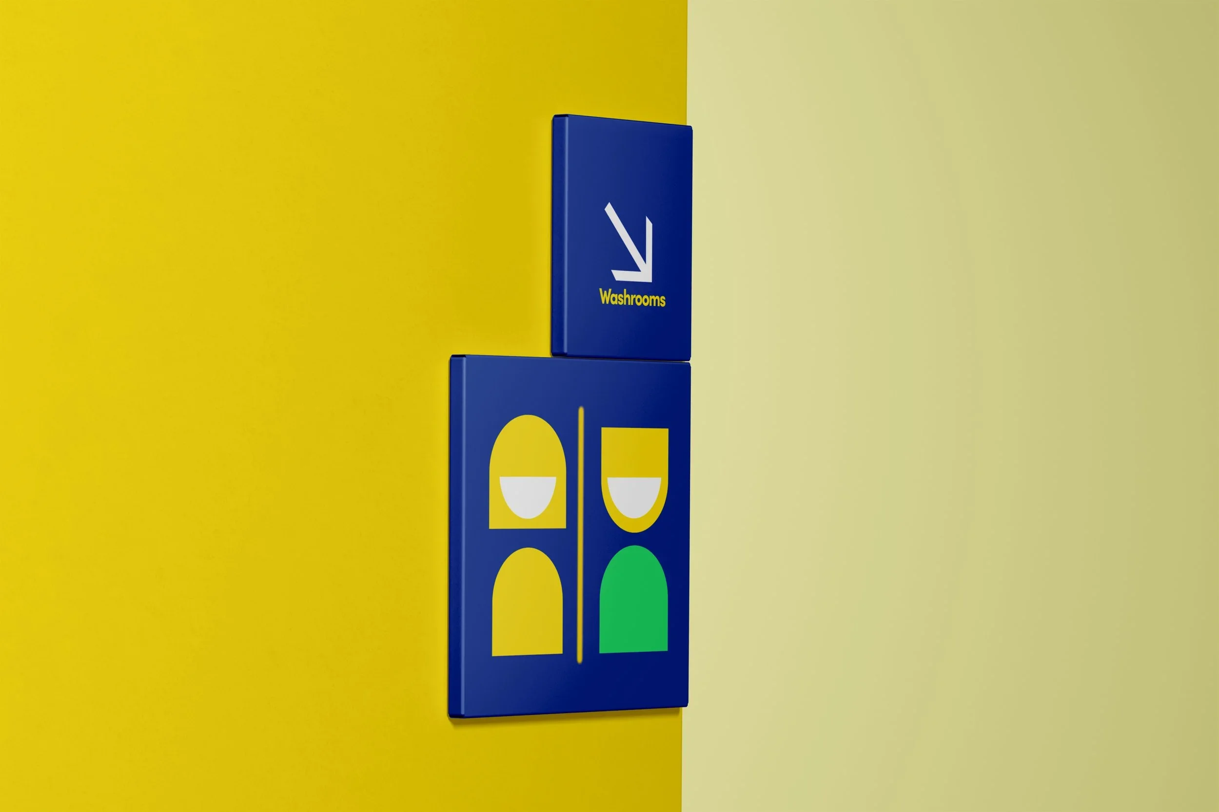
The final identity became as playful as the children it represents. Bright, block-inspired shapes stack together like a child’s toy, while the sun motif brings warmth and positivity into every touchpoint. Parents connected with the cheerful colors and approachable visuals, while kids instantly recognized the shapes as part of their everyday play. The result was a brand that doesn’t just look sunny — it feels like stepping into a place full of laughter, light, and imagination.
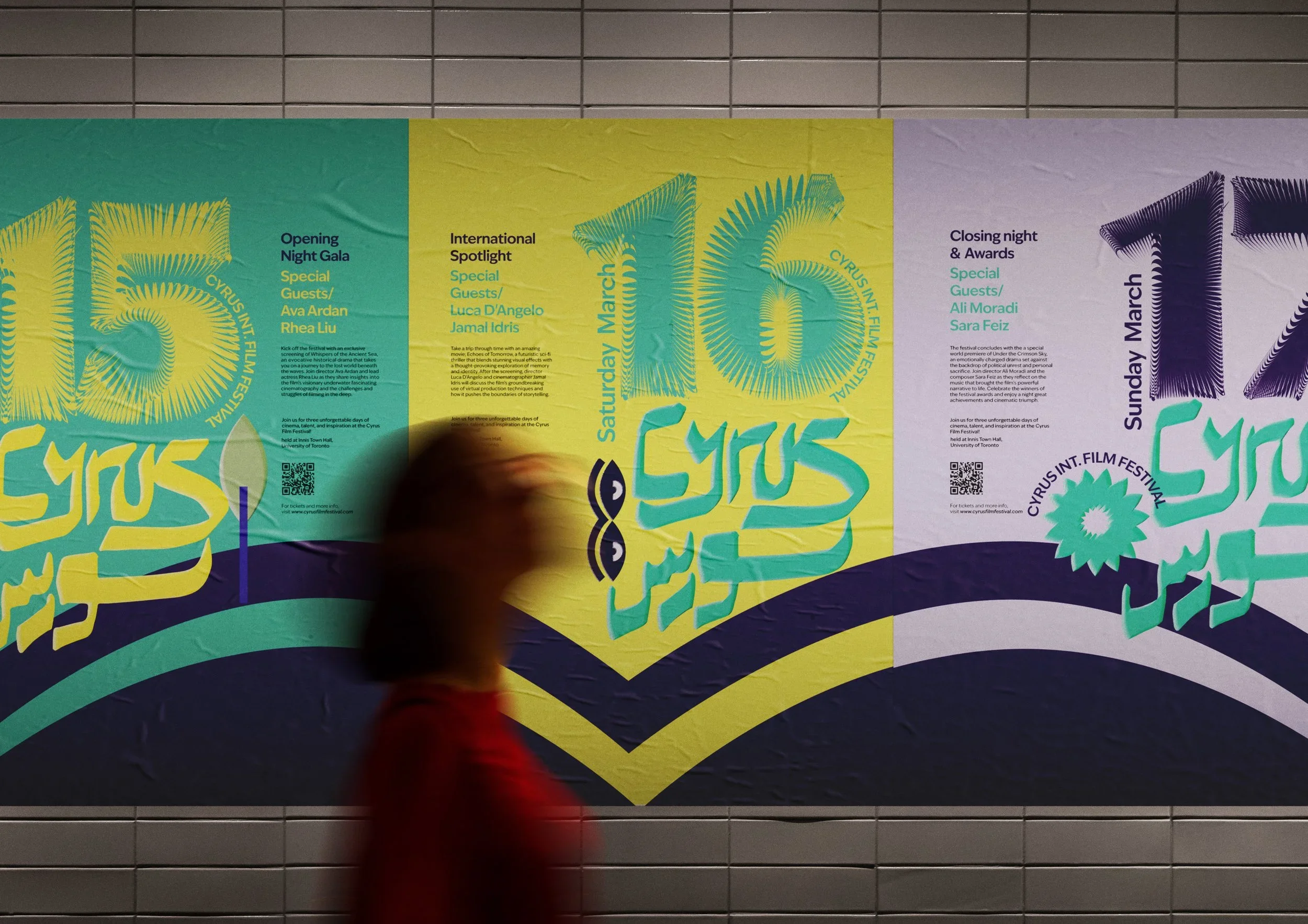
Cyrus International Film Festival
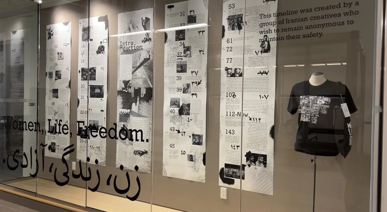
Women.Life.Freedom

Zarin Magazine